1. Context & Intent
This process study documents a controlled image-finishing workflow that combines AI image generation with traditional photographic color grading and exposure discipline.
The goal was not stylization, fantasy glow, or “AI spectacle,” but rather:
- Cinematic, observational realism
- Believable natural light
- Restrained color temperature
- A finished image that does not advertise its process
The guiding principle throughout was simple:
AI generates the negative.
Human judgment finishes the image.
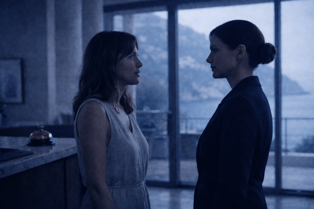
2. Source Image (Lumivore Output)

The original image was generated using Lumivore (via ChatGPT) for a scene between Isadora Quinn and Salome in Part II of The Concierge Always Knows story, with careful attention to:
- Coherent light direction (late afternoon / golden hour)
- Natural material response (fabric, foliage, bark)
- Balanced composition and depth cues
The Lumivore output was already strong. This was not a corrective rescue, but a finishing process.
The objective was to preserve what worked while refining tone, balance, and perceptual realism.
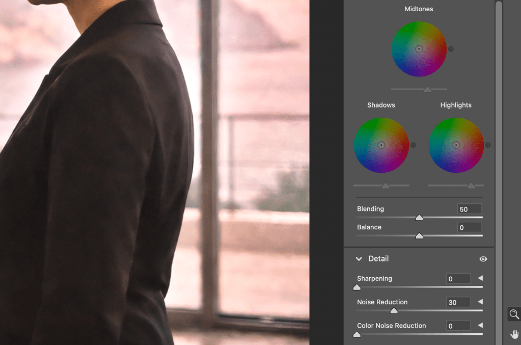
3. Layer 1 — Structural Grade (Image #1)
The first Photoshop 2026 layer focused exclusively on structural integrity.
This layer answered the question:
“If this were a perfectly exposed negative, how should it behave?”
Photoshop Tools Used
- Levels
- Shadows / Highlights
- Color Balance (Midtones & Highlights only)
Key Decisions
Levels
- Black point set gently above zero to anchor shadows without crushing
- Midtone gamma lifted slightly to open forest detail
- White point left untouched to preserve highlight rolloff
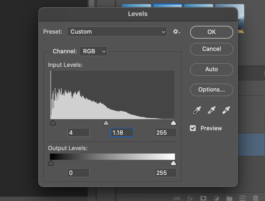
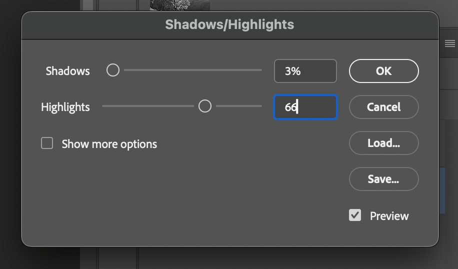
Shadows / Highlights
- Shadows minimally lifted to recover texture
- Highlights significantly softened to prevent golden-hour bloom
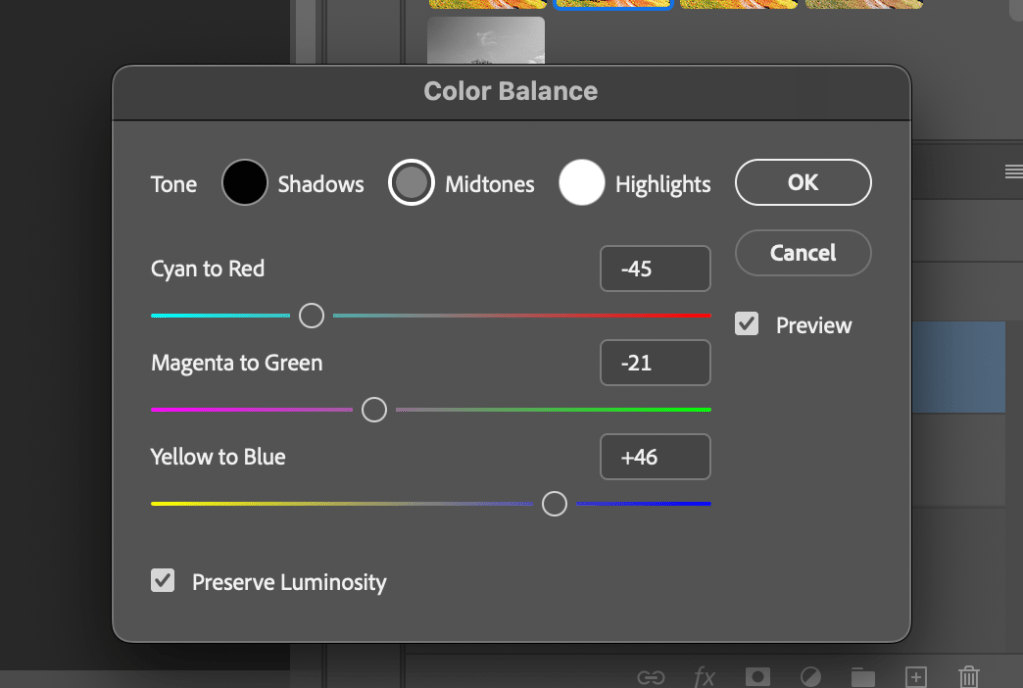
Color Balance
- Warmth introduced primarily in midtones
- Highlights warmed carefully to suggest light temperature, not filtering
- Preserve Luminosity enabled to maintain contrast integrity


Result
Image #1 reads as physically accurate:
- Breathable shadows
- Natural warmth
- Realistic highlight behavior
At this stage, the image is already usable—but emotionally neutral.

Layer 2 — Perceptual Counterbalance (Image #2)
The second layer intentionally pulls against the first.
This layer exists because perceptual tools (contrast, pop, vibrance) can easily push an image into artificial territory if left unchecked.
This layer answered a different question:
“How does the image feel after enhancement—and how do I re-center it?”
Tools Used
- Color Balance (cooling counter-pass)
- Landscape – Pop
- AI Denoise
- Vibrance / Saturation
Key Decisions
Color Balance
- Midtones cooled aggressively to counter accumulated warmth
- Green bias restored to foliage to prevent orange drift
- Highlights cooled gently to preserve believable light behavior
This was not mood-cooling—it was corrective neutrality.

Landscape – Pop
- Used to increase micro-contrast and presence
- Applied knowingly, with the understanding it would require correction afterward

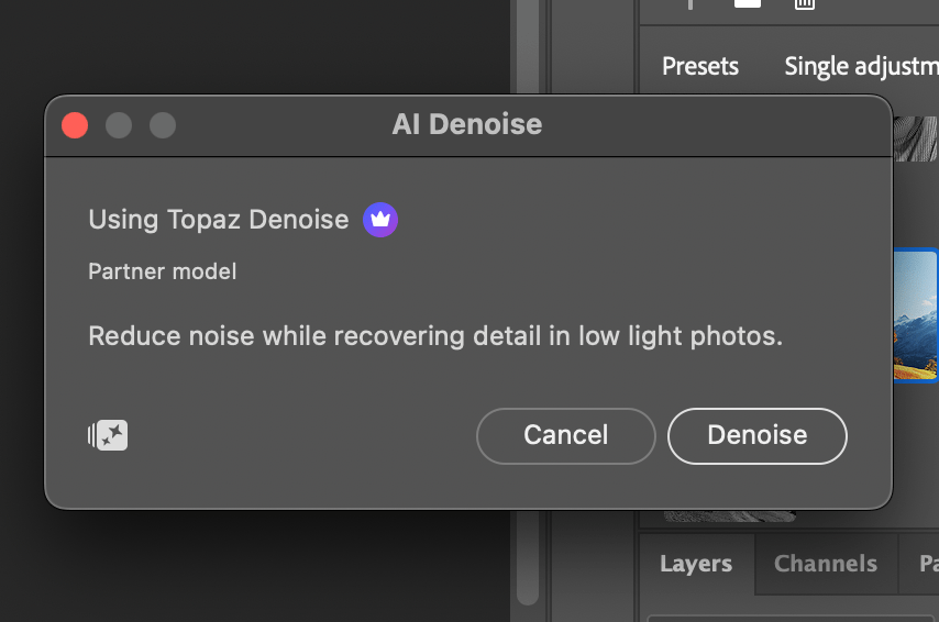
AI Denoise (Filter)
- Applied after contrast enhancement
- Prevented micro-contrast from turning into grit or shimmer
- Preserved organic texture
Vibrance (over Saturation)
- Vibrance used as the primary color amplifier
- Saturation kept low to avoid cumulative color inflation

Result
Image #2 reads as controlled but cooler, emphasizing realism and gravity over warmth.
On its own, it is not the final image—and it is not meant to be.
5. Final Composite — Resolution & Balance (Image #3)
While the image was combined, additional tweaks were needed, which involved adjusting additional Noise Reduction, Color (Midtones, Shadows, and Hightlights) through the Camera Raw Filter.
When Layer 1 and Layer 2 are combined—with final tweaks—the result is Image #3.
This image is not an average of the two layers.
It is their resolution.
What Resolves in the Final Image
- Warmth remains, but feels earned
- Highlights glow without blooming
- The subject separates naturally from the environment
- The image reads as captured, not processed
Nothing in the final image draws attention to itself—not color, not contrast, not technique.
That invisibility is intentional.

6. Key Takeaways
- AI image generation benefits from traditional finishing discipline
- Separation of structural correction and perceptual refinement prevents overprocessing
- Opposing color passes can stabilize realism rather than dilute it
- The final 10% of image quality is human judgment, not prompting
7. Closing Reflection
This process reinforces a core belief:
AI is a powerful collaborator—but authorship still lives in the finish.
The value of this workflow lies not in the sliders themselves, but in the intentional separation of roles:
- AI for image generation
- Human for restraint, balance, and final authority
This study represents not a one-off edit, but a repeatable philosophy for finishing AI-generated imagery with professional discipline.

You must be logged in to post a comment.